The Light Princess
The designers of Bernheimer Architecture — assisted in this project by Christiana MacGregor and Amanda Park — found the story fascinating, and their own description of the princess seems to me in tune with MacDonald’s. “She is a liberated, free-thinking woman who shirks convention,” they said, “but while this independence and uniqueness is presented as a curse, we viewed it as something modern— even anachronistic.” And more, they experienced “her literal lightness as a gift, to her and us. As architects, we traffic in gravity — sometimes too ponderously! Our structures are weighted. They are fixed; built in response to the constraints of mass, force, and direction. So we saw the lightness of the princess as integral to her identity. Even as a kind of privilege.”
— Kate Bernheimer
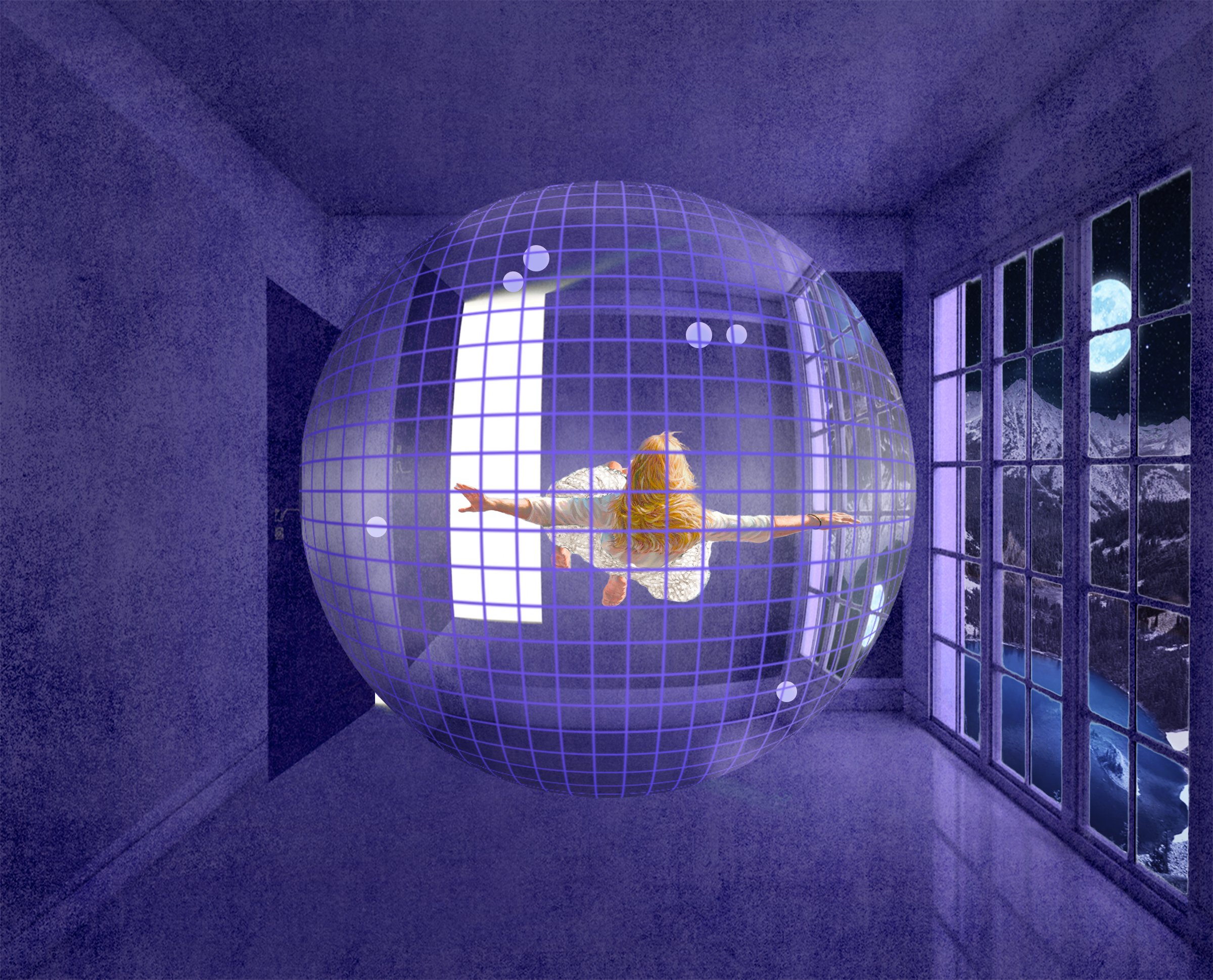
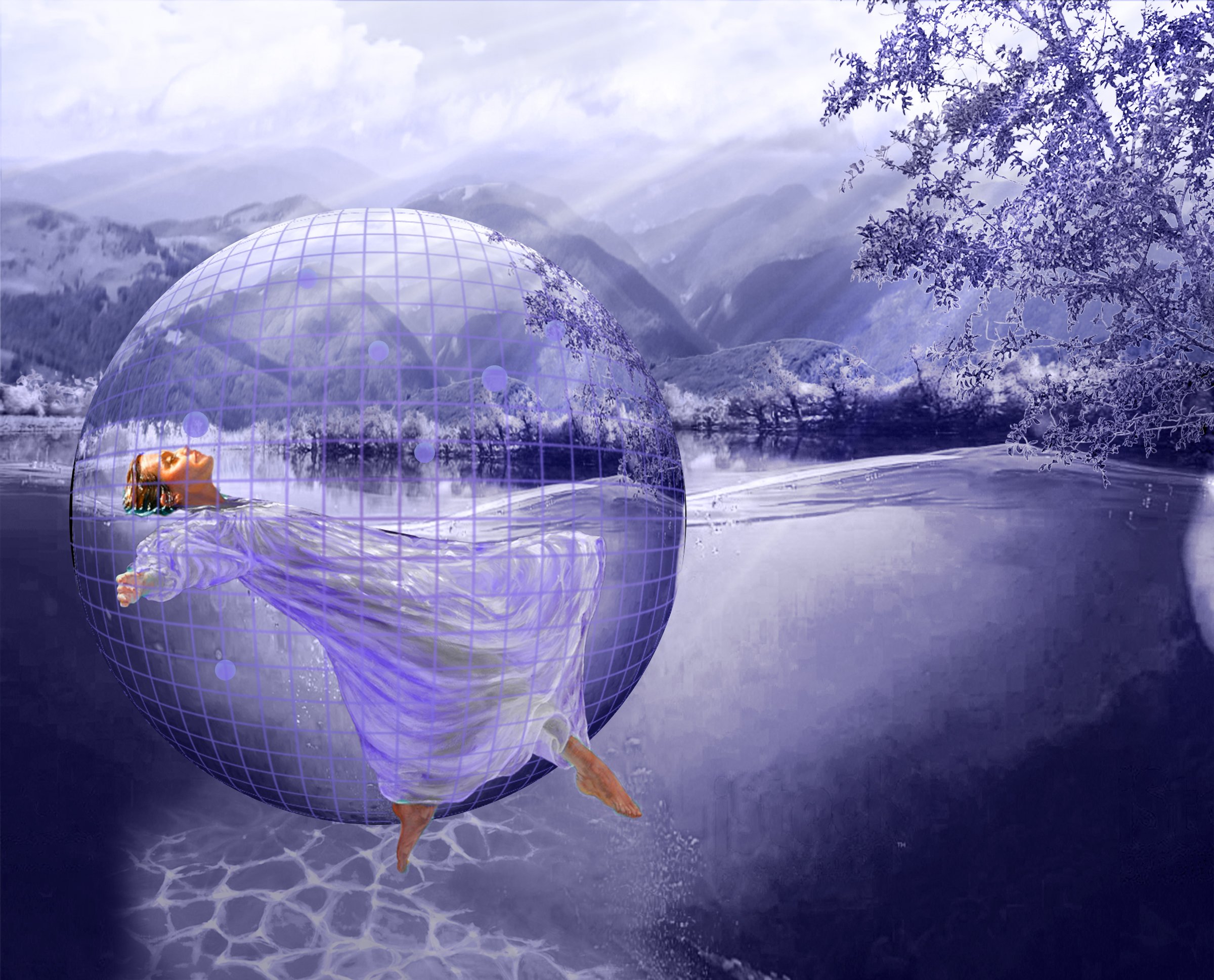
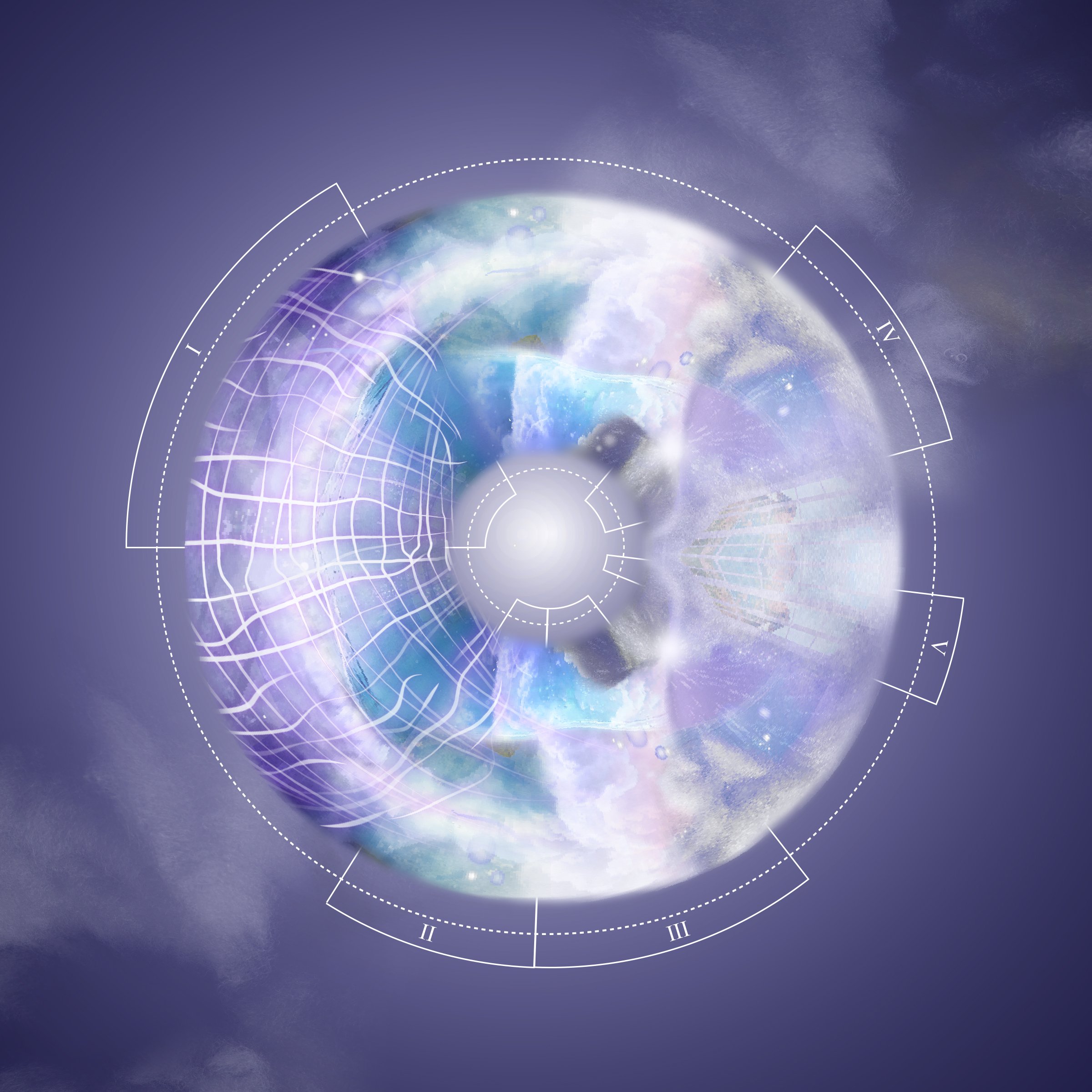
We had to consider the question of identity as well as perspective. In the case of the princess, we considered her body position relative to the ground; relative to the story itself, we focused on our own position as delineators. When the princess is viewing her own position within the space of the story, the pieces within her field of view are distorted. At the same time, the illustrations are also from the perspective of the reader seeing the princess floating or tethered.
Notation and measurement (specifically, in the form of a gridded “field” that defines the space of the princess’s lightness) move these drawings from mere illustration into more defined spatial constructs. We counter these “scenes” with a culminating, immersive view that collects the actions of the story — the position of the Princess drawn purely through her own eyes and as a circular, although measured, field.
— Bernheimer Architecture
abridged from Places Journal
Curated by
Kate Bernheimer and Andrew BernheimerPublished in
Places Journal
Related Research


